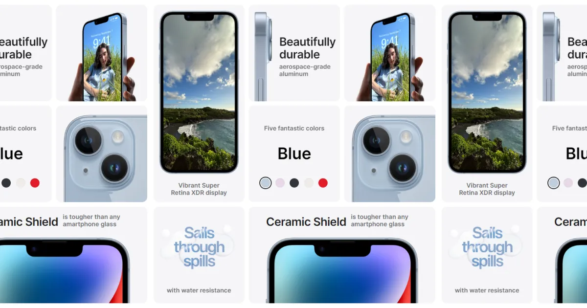
Code the iPhone 14 Landing Page, Gallery Grid
Today I would like to cover how I recreated a section of the iPhone 14 landing page. Apple appears to call this section the “design gallery” (based on what I can inspect in the browser). This section stuck out to me because of its elegant grid and snappy interaction.
Read more on Medium
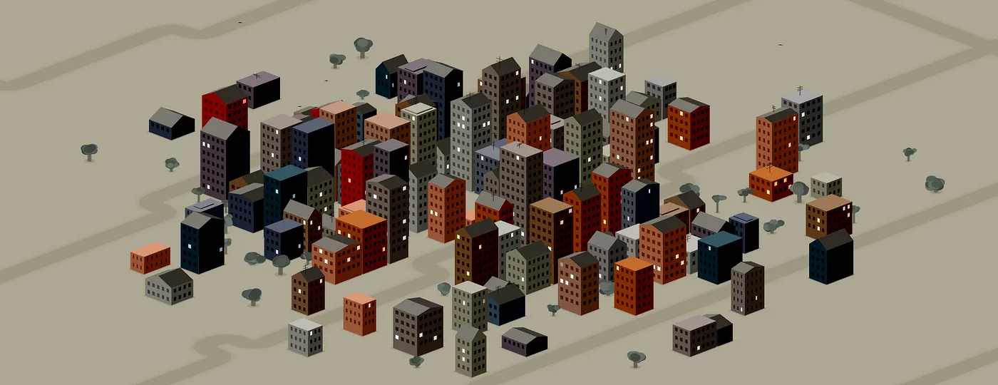
Code Roundup #1 | November 2022
Each month I collect the most interesting and useful code snippets from sources like Codepen, Glitch, and Replit. Have any snippets that I missed? or are you writing cool code on different platforms? Comment what you’ve been working on so that I can feature you!
Read more on Medium
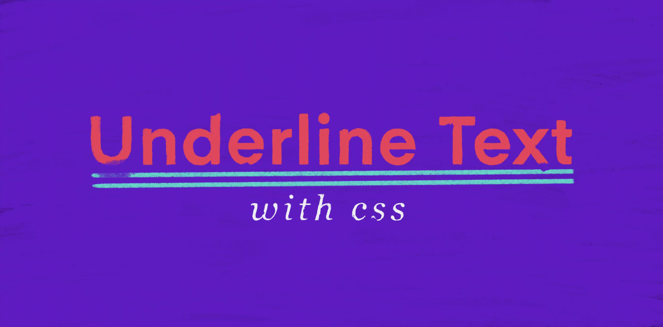
How to Underline Text with CSS & Customize the Style
We’re most often used to a text underline to indicate a hyperlink. But, what if you’re after a super fancy styled underline? Or maybe not an underline at all, perhaps you want an overline or a strike-through?
Read more on Medium
VR Prototyping #3 | Illustration Interaction Experiment
The last several VR prototypes I put together were largely utility focused. For this next prototype I wanted to go a little bit more artistic and playful. This gave me a chance to practice my modeling and texture skills a bit more
Read more on Medium
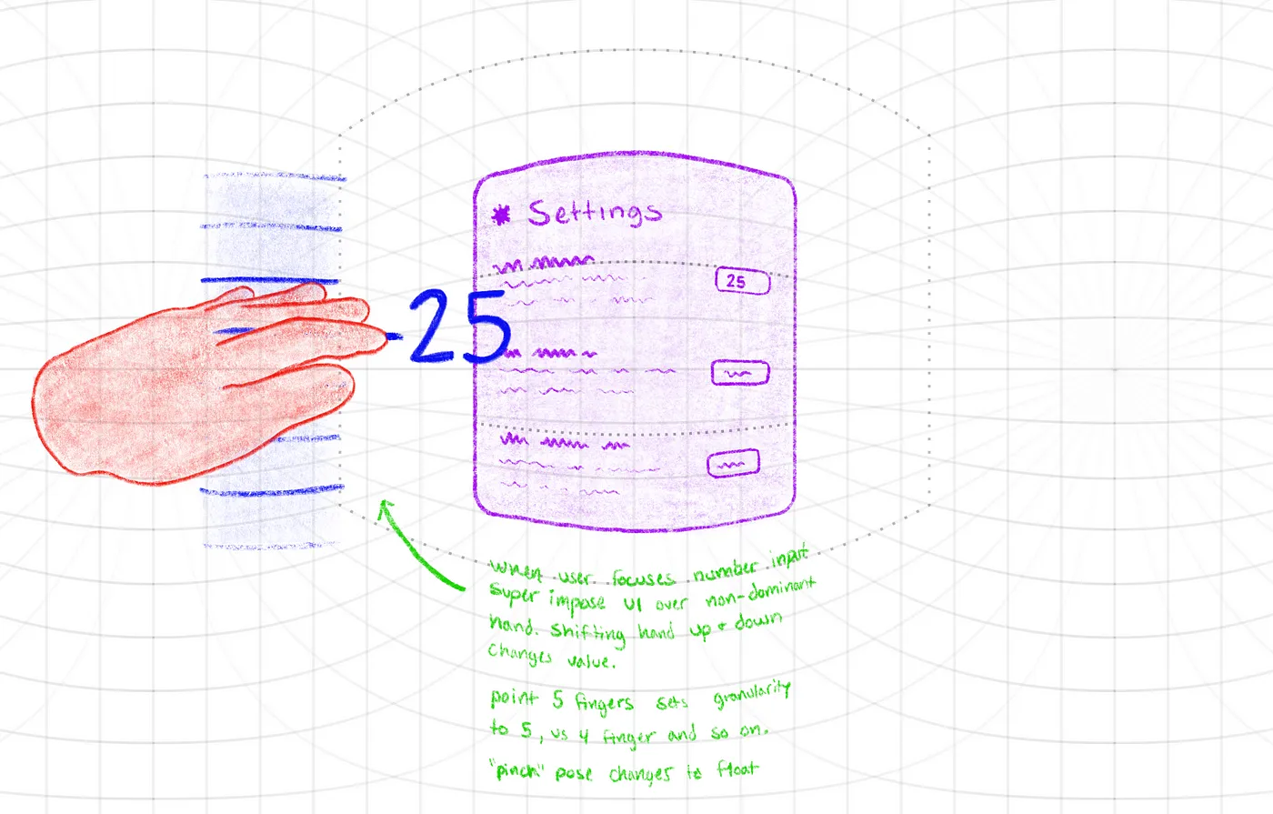
VR prototyping #2 | number input
I kept this VR prototype simpler than the ones in the past. Check out a recent VR prototype here: Meta Horizon Worlds Selection. For this prototype, I wanted to enhance a simple number input.
Read more on Medium
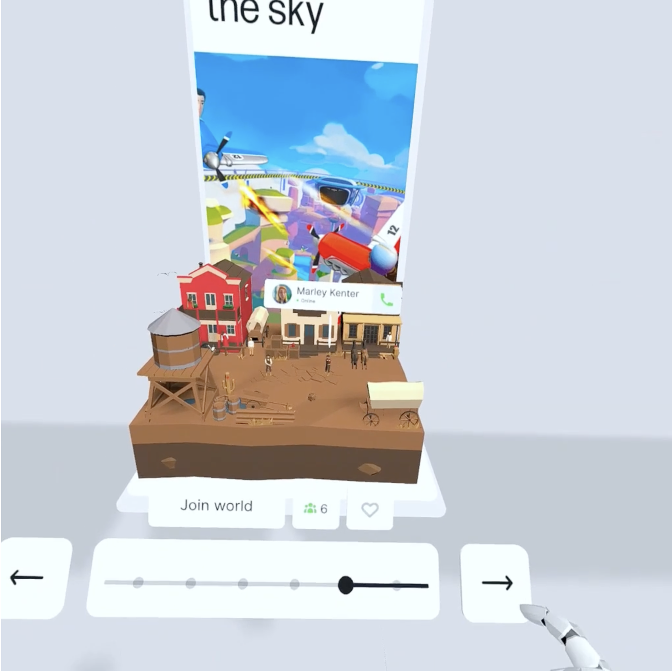
VR Prototyping #1 | Meta Horizon World Selection
One thing I’ve noticed a lot about Meta’s Horizon Worlds (and a lot of XR experiences) is their use of 2D UI (user interfaces) throughout their experiences. There is nothing inherently wrong with this of course.. but.. like, come on.. there’s gotta be some missed value that a more spatial experience could provide.
Read more on Medium
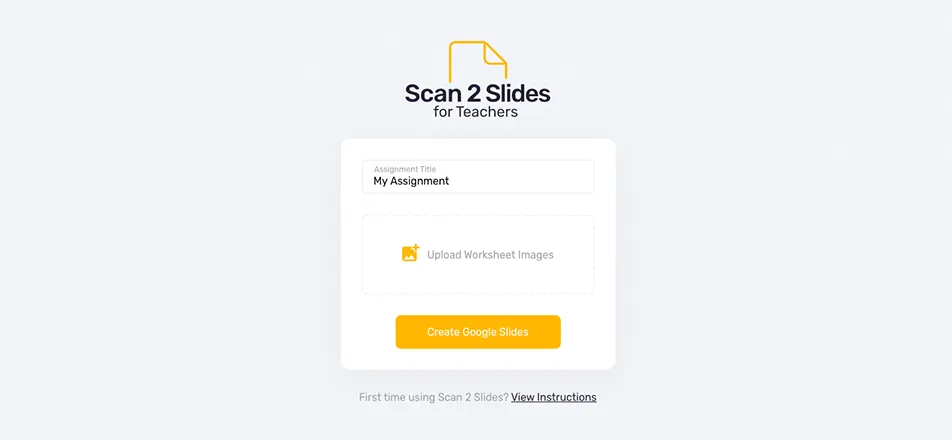
What is Scan 2 Slides?
Scan 2 Slides is a Google Script web app I put together to help minimize the time it takes to go from a physical worksheet to a Google Slides worksheet.
Read more on Medium
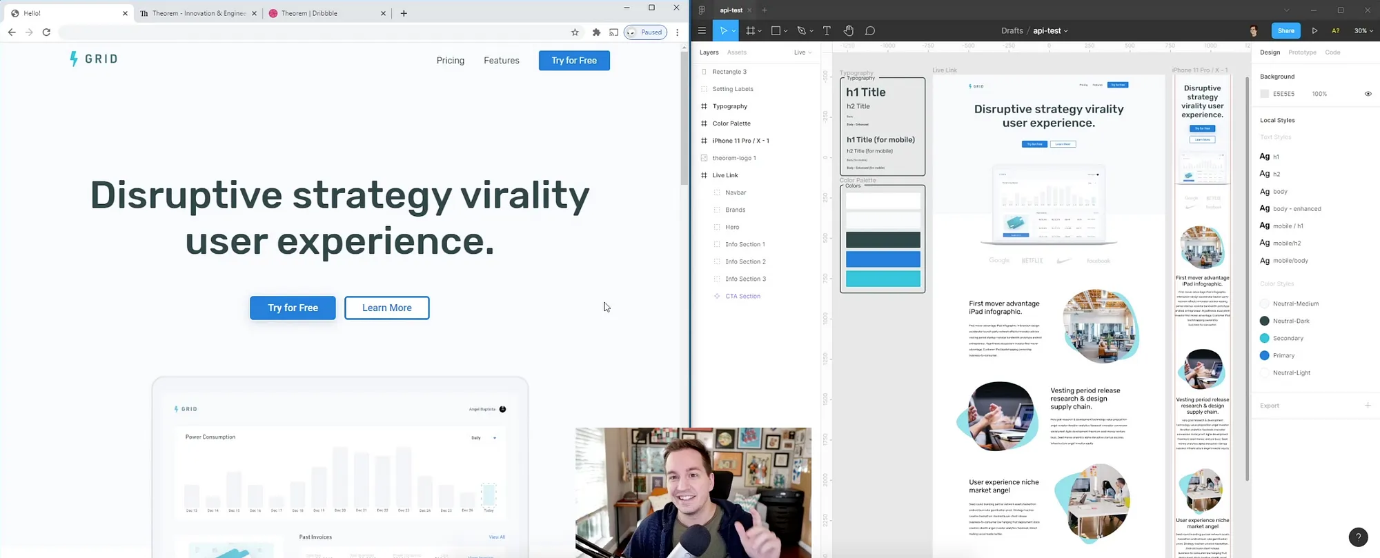
Figma API Demo
I finally had a chance to mess around with the newest version of the Figma API. I put together this little demo for internal-Theorem knowledge-sharing. Basically, I designed a quick landing page in Figma, coded out that design to a live page but synced up the styles, images, text, etc to the Figma document.
Read more on Medium
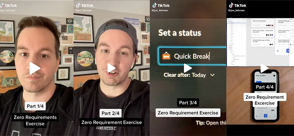
Zero Requirement Exercise
Over the last couple of weeks, I engaged in a fun exercise to help my creativity. I have found that when working on long-term projects it is easy for your creativity to become stagnant and to feel like you’re stuck behind a block.
Read more on Medium
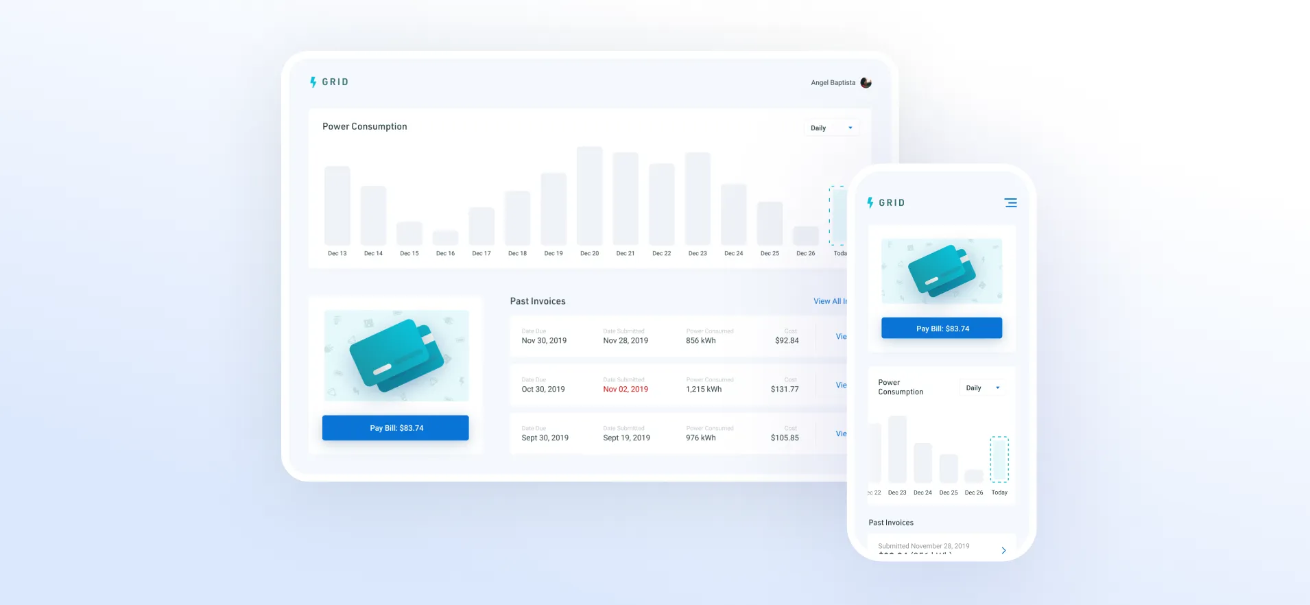
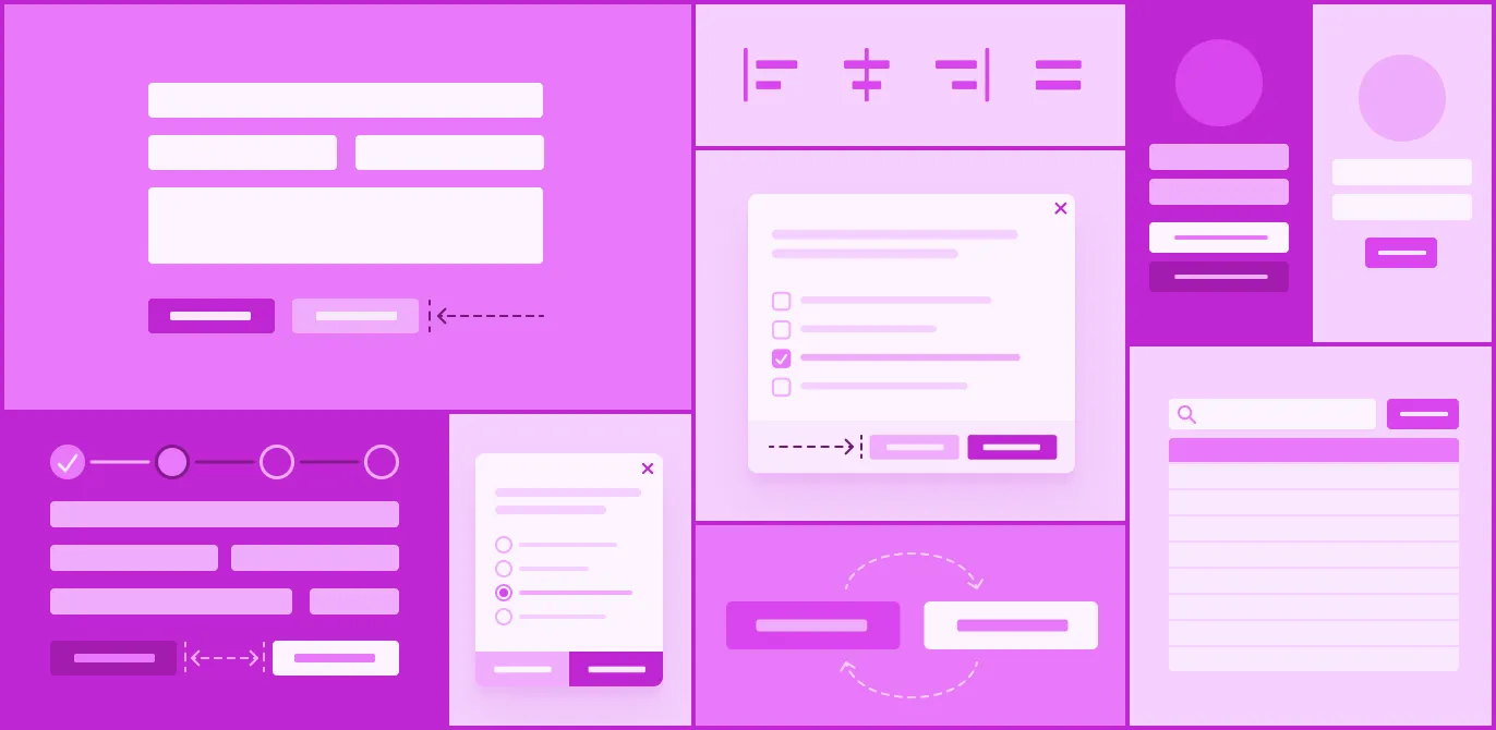
Dashboard UI Exploration
I put together this dashboard UI exploration just for fun and to test out documenting the process in a timelapse. The time-lapses also provided me with content to try out TikTok for my first time. Apart from some of TikTok’s less-desired attributes, I found the platform very fun, intuitive, and engaging.
Read more on Medium
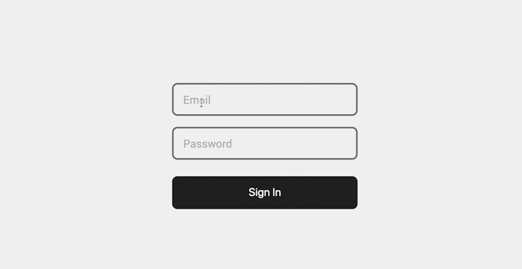
Floating Label Experiment
I had a small idea for a simple floating label style that would essentially “clip” the border of the input as the label “floats”. Another key part of the idea was to add a more impactful third state for while the input was focused, I felt that too many of the floating label input patterns out there didn’t emphasize the focused input label enough. I first put it together in Figma and then also coded it out in CSS.
Read more on Medium
Side Project Completion Strategy
Stepping into parenthood triggers many life changes. I’ve learned that one of those changes was the sudden and apparent importance of time management. I found myself jumping from project idea to project idea without the time or focus to complete any of them.
Read more on Medium
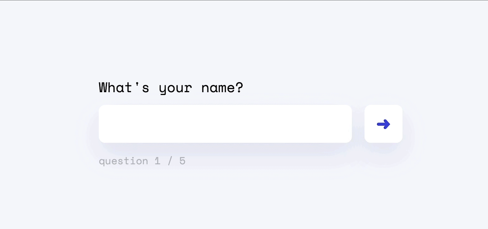
Quick Survey Experiment
This was just a quick experiment to take a code snippet I had previously put together and expand upon it to make the UI a bit slicker and fun. I had used jquery for the previous code snippet so I went ahead and continued using it for this experiment. Though, I think I’d like to refactor this and have it just be vanilla js.
Read more on Medium
Button Ambiguity: Alignment & Order
At TheoremOne, we have found that we run into the same small, derailing conversations from project-to-project. These conversations can be difficult to navigate if they involve subjectivity. One example would be buttons. Specifically, button alignment and sort order. So, here’s some quick objectivity for ya:
Read more on Medium
Why To (sometimes) Rush Initial Design
So you’ve just landed your agency a sweet gig, you’ve had your discovery meeting and you just sat back down at the office. There are several reasons why I believe (in certain situations) it is best to rush your initial design / wireframes and get it in front of your client as soon as possible.
Read more on Medium

Floating Labels with only CSS
Floating labels really took precedence with the launch of Google’s Material Design. They have been widely accepted because of solving the age-old UX argument between multiple form input field solutions.
Read more on Medium

Designers Finally Have a Spot at the Table… Now What?
Designers have been waiting for this moment for decades; principles like “design thinking” are finally becoming a forefront in many large businesses. Before companies like Apple, designers were not valued nearly as much as they are today.
Read more on Medium