From zero to $3M ARR: Designing a category-defining data platform for banks, credit unions, and specialty finance.
My Roles
- Product Designer
- Coding Prototyper
- Marketing Director
Product Designer, Coding Prototyper, Marketing Director
My Team
- 2 Founders
- 2 Frontend engineers
- 4 Data engineers
- 6 Visual designers/artists
2 Founders, 2 Frontend engineers, 4 Data engineers, 6 Visual designers/artists
My Tools
- Figma
- Svelte, Javascript, Tailwind
- Lottie, After Effects
- Framer
Figma, Svelte, Javascript, Tailwind, Lottie, After Effects, Framer
Company
- Annual Revenue $0-$3M
- Company size: 2-20
- Industry: Fintech
Annual Revenue $0-$3M, Company size: 2-20, Industry: Fintech
The Industry
The world of lending is full of moving parts. Banks, credit unions, and specialty finance companies rely on a patchwork of systems to get things done. It's highly regulated, deeply operational, and more dependent on data than ever before.
The Founders
Gestalt was founded by fintech veterans who know this space inside and out. Stephanie built and sold one of the top LOS platforms in auto finance. Justin brings deep product and tech experience from both startups and the Fortune 50. Together, they know how to build for scale.


The Problem
Financial institutions are drowning in disconnected data. Every system speaks a different language, and stitching it all together is slow, messy, and expensive. Stephanie and Justin saw this pain up close while helping lenders modernize at defi, and knew there had to be a better way.

Every month is a scramble. We pull from five systems, then spend hours in Excel hell just trying to make the numbers line up.
I spend more time fixing broken data feeds than actually improving anything. Every integration feels like it could snap.
A regulator asked where a number came from and we had no clue. That kept me up for days. We have to trust our data.
Our Solution
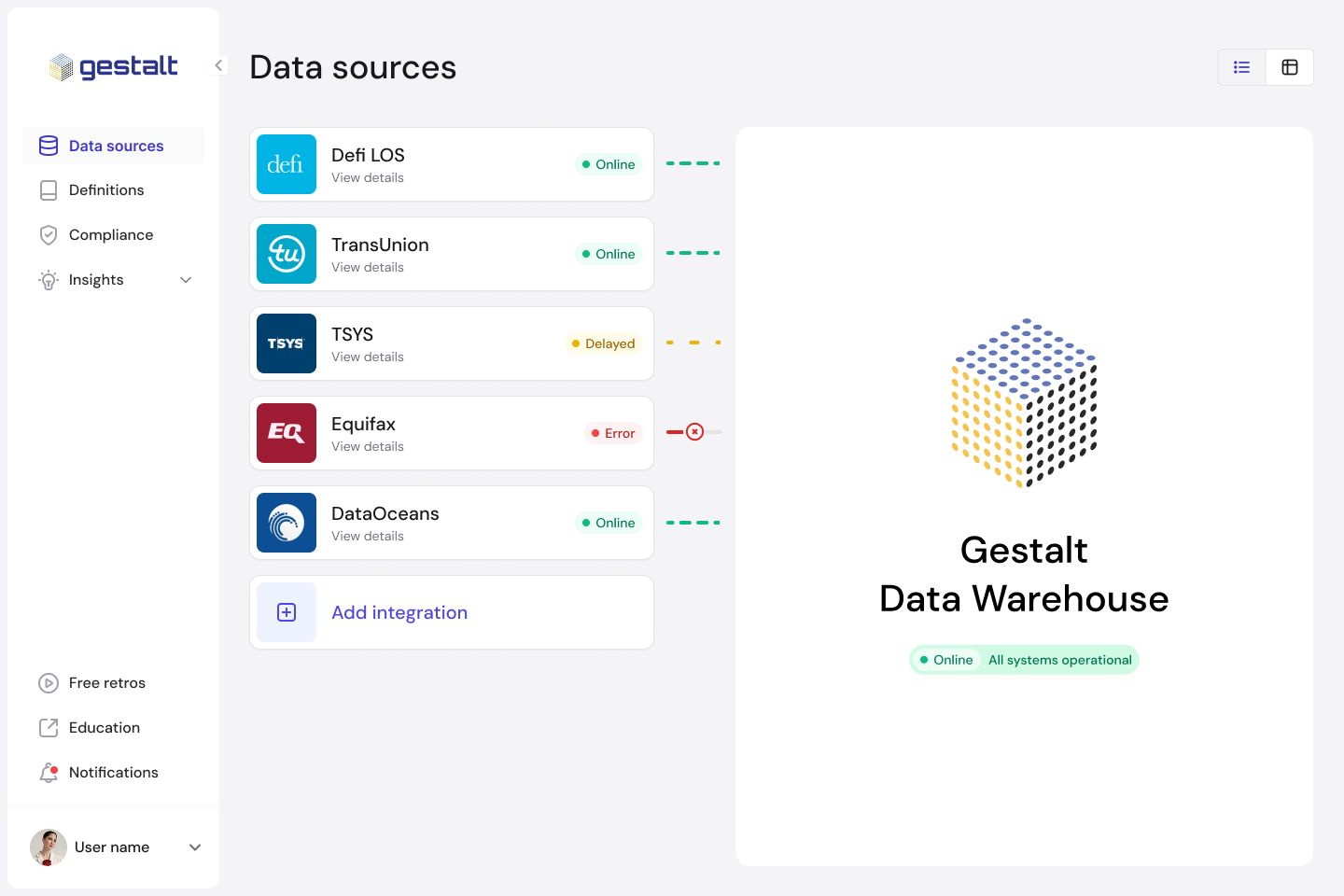
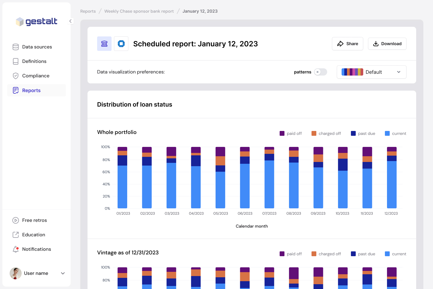
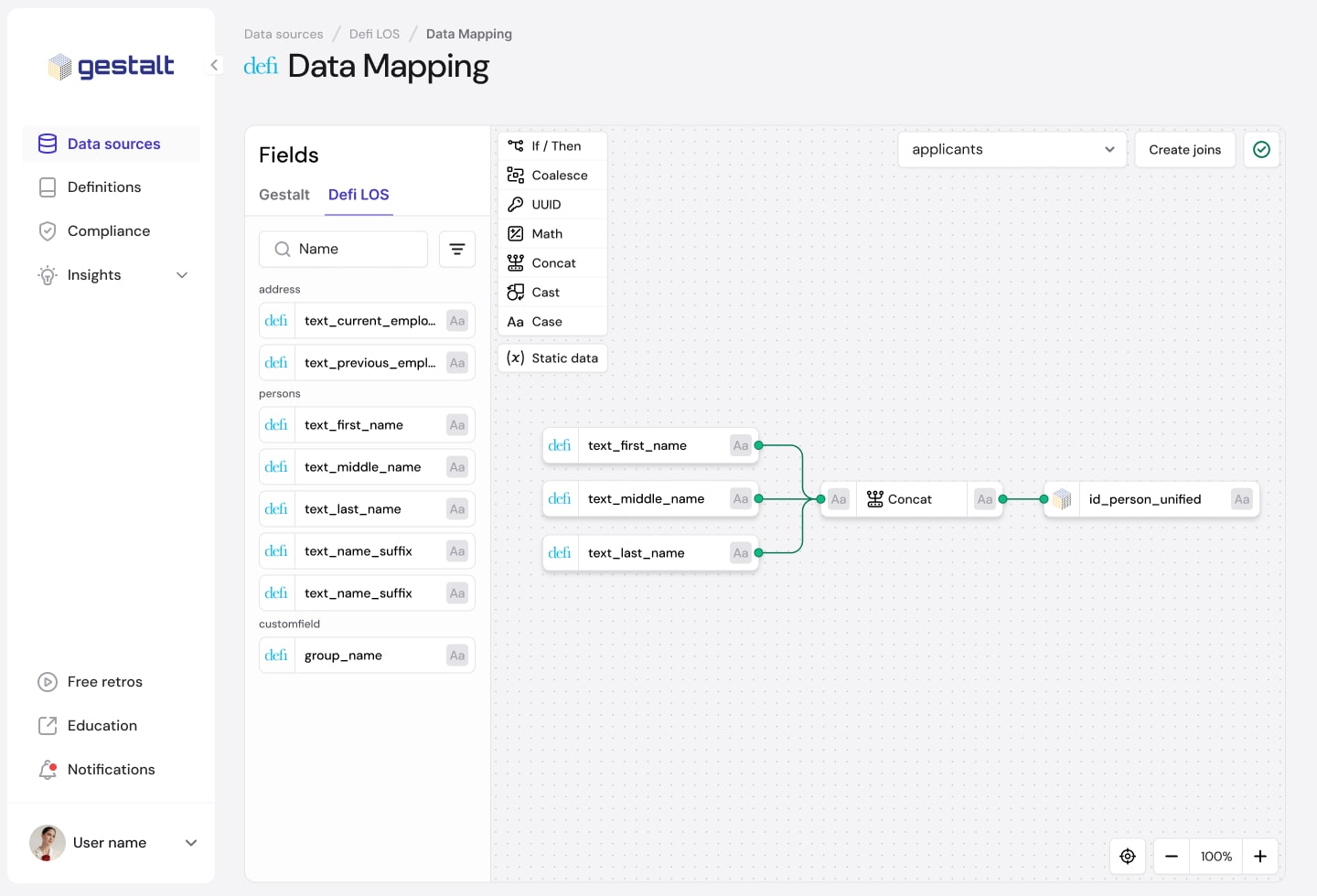
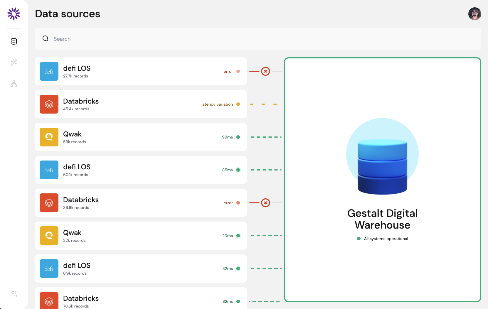
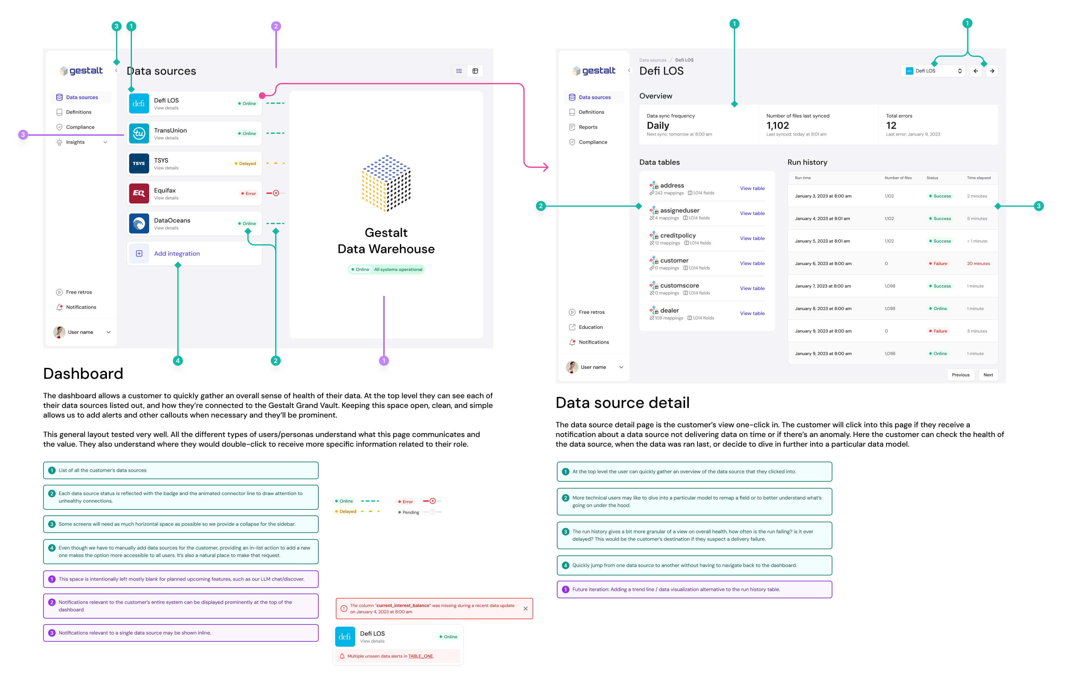
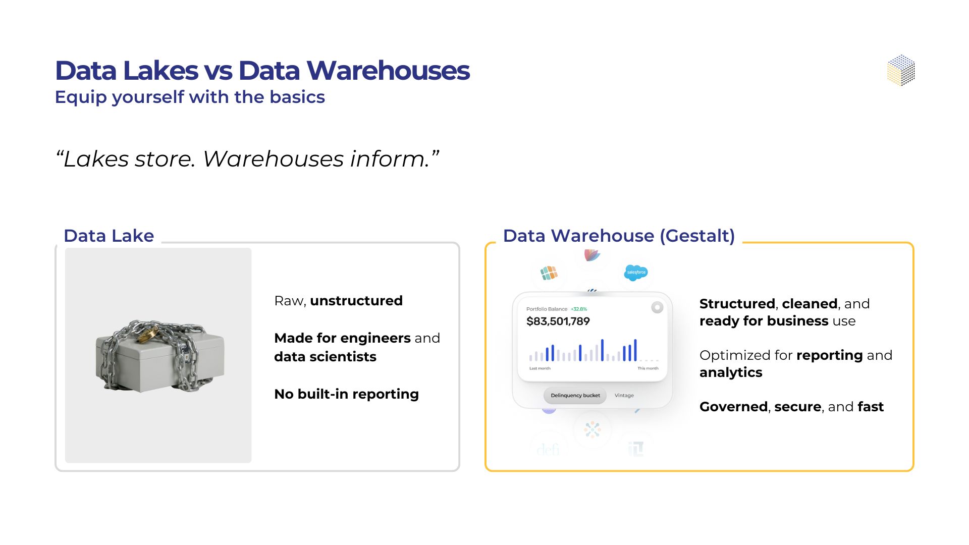
Gestalt is the data foundation built for financial institutions. We centralize all of your data across systems like LOS, LMS, servicing, accounting, and compliance. Then we deliver it in a clean, consistent, and queryable format. With built-in governance, lineage, and anomaly detection, Gestalt turns data chaos into clarity. No more stitching spreadsheets or chasing down inconsistencies. Just audit-ready, decision-grade data from day one.
Our Goals

Reach $3M ARR within 3 years
We’re building a business with momentum. Our target is $3 million in annual recurring revenue by our third year in market, driven by strong customer retention and real product value.

Reach 32 paying customers
Credit unions, banks, and specialty lenders. Our goal is to earn the trust of 32 institutions that rely on Gestalt as their data foundation.

Achieve a 95% renewal rate by year 3
We’re building a product that earns its place. If customers aren’t eager to stick around, we’re not doing our job. Our goal is to prove long-term value where it counts, renewals.
Building the Product
Project Timeline & Needs
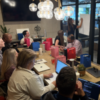
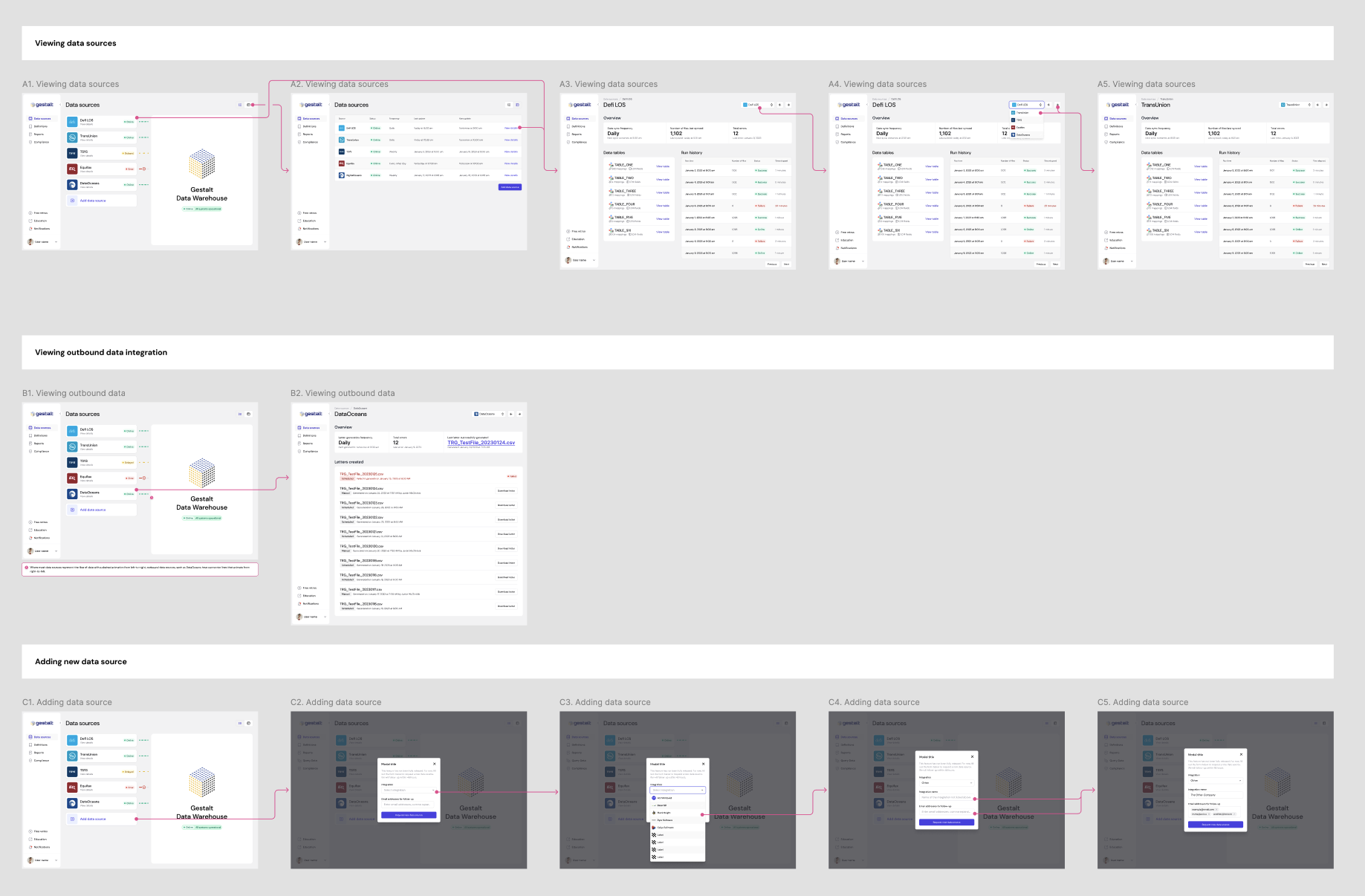
When I joined, the founders were already selling the product. The only catch? It didn’t exist yet. The team had a bold vision, early customer interest, and a packed calendar of demos. What they didn’t have was something tangible to show. They needed a way to make the dream feel real. Fast.
I was brought in to bridge that gap. Not just with design files or static mockups, but with something people could actually click through. Something that looked and felt like the real product, even if the data wasn’t live yet. We had to move quickly and deliver iteratively, because every week brought more calls and more opportunities to earn trust.
I designed the interface and built a working prototype that could be pulled up on any computer. It became our demo environment, our pitch tool, and the thing that helped prospects go from curious to convinced.
Initial Research
While I was rapidly building prototypes to help Gestalt sell the vision, I knew speed alone wouldn’t cut it. We had to make sure we were solving the right problems in the right way. That meant carving out time for research, talking to the people who knew the space best and pressure-testing every assumption. With each new feature or decision, we looped in stakeholders, end-users, current customers, and prospects. Our process was fast, focused, and built to adapt.
Creating our hypothesis
We regularly met with our founders and board to shape our initial approach. They brought decades of experience in lending and data. As we grew the team, each new hire added more industry insight we could tap into.
Interview Stimulus / First Prototype
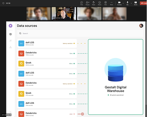
The first coded prototype wasn’t just for selling. It gave us something real for users to react to. Clicking through a live interface sparked better conversations than any static mockup could.
Testing Our Hypothesis
We ran tests wherever we could. In person at client offices, online with remote users, or during early sales calls. Since our prototype ran in the browser and felt real, it made feedback more honest and actionable.

Want more details on how we tackled our research? Give me a call and I’ll give you the scoop!
Information Hierarchy & Wireframing
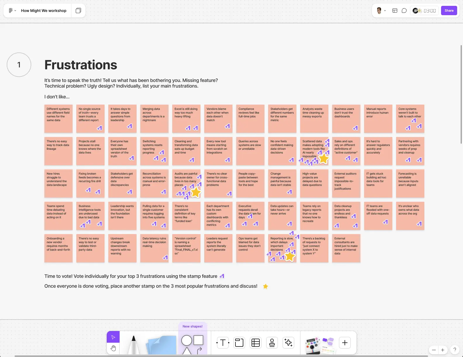
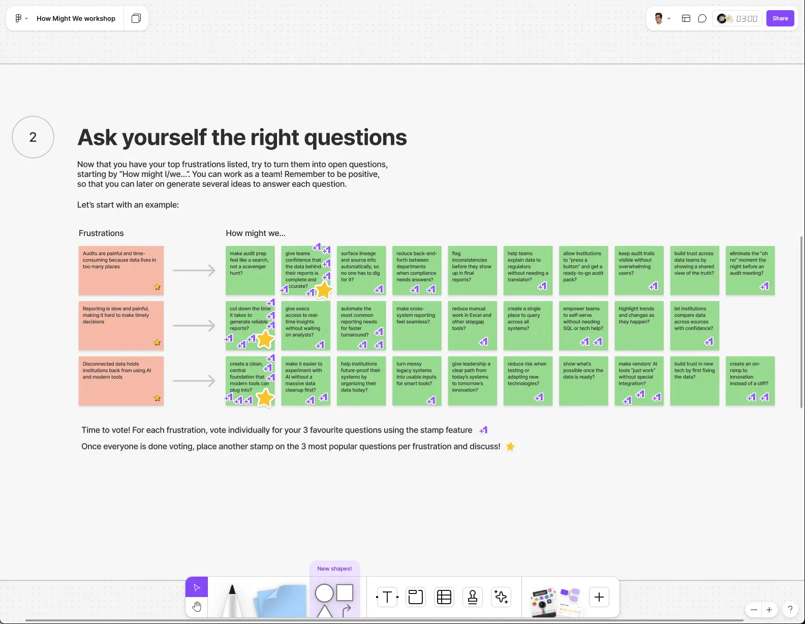
Before jumping into high-fidelity design, I always zoom out. Fast doesn’t mean careless. Slow is smooth, smooth is fast. I started by mapping the core flows and structure of the product, making sure we had a foundation that could grow with us. This is where the product starts to take shape, not in pixels, but in priorities and use-cases.
At this stage, I was thinking beyond just “what goes where.” I was considering how this layout would scale with new features, how we’d guide users through complex data, and how we’d keep the product flexible enough to support different customer types. Every box and arrow had a job to do.
It wasn’t just about getting today’s features right. It was about creating a system that could flex if we expanded into new sectors, introduced new data types, or reimagined a workflow. Good wireframes don’t just lay things out—they lay the groundwork.
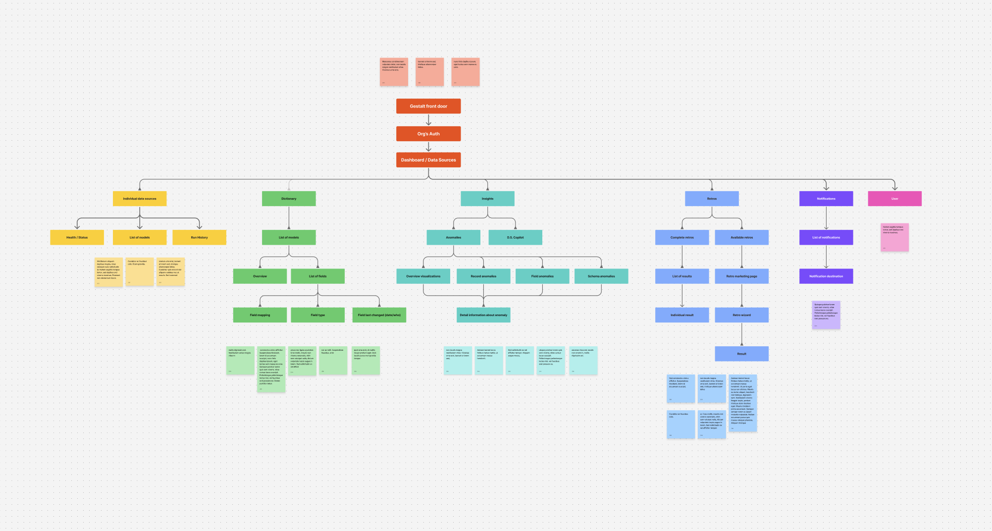
Unfortunately, I didn't keep my earlier drawn wireframe, so you'll just have to take my word for it ;D
Test and Measure
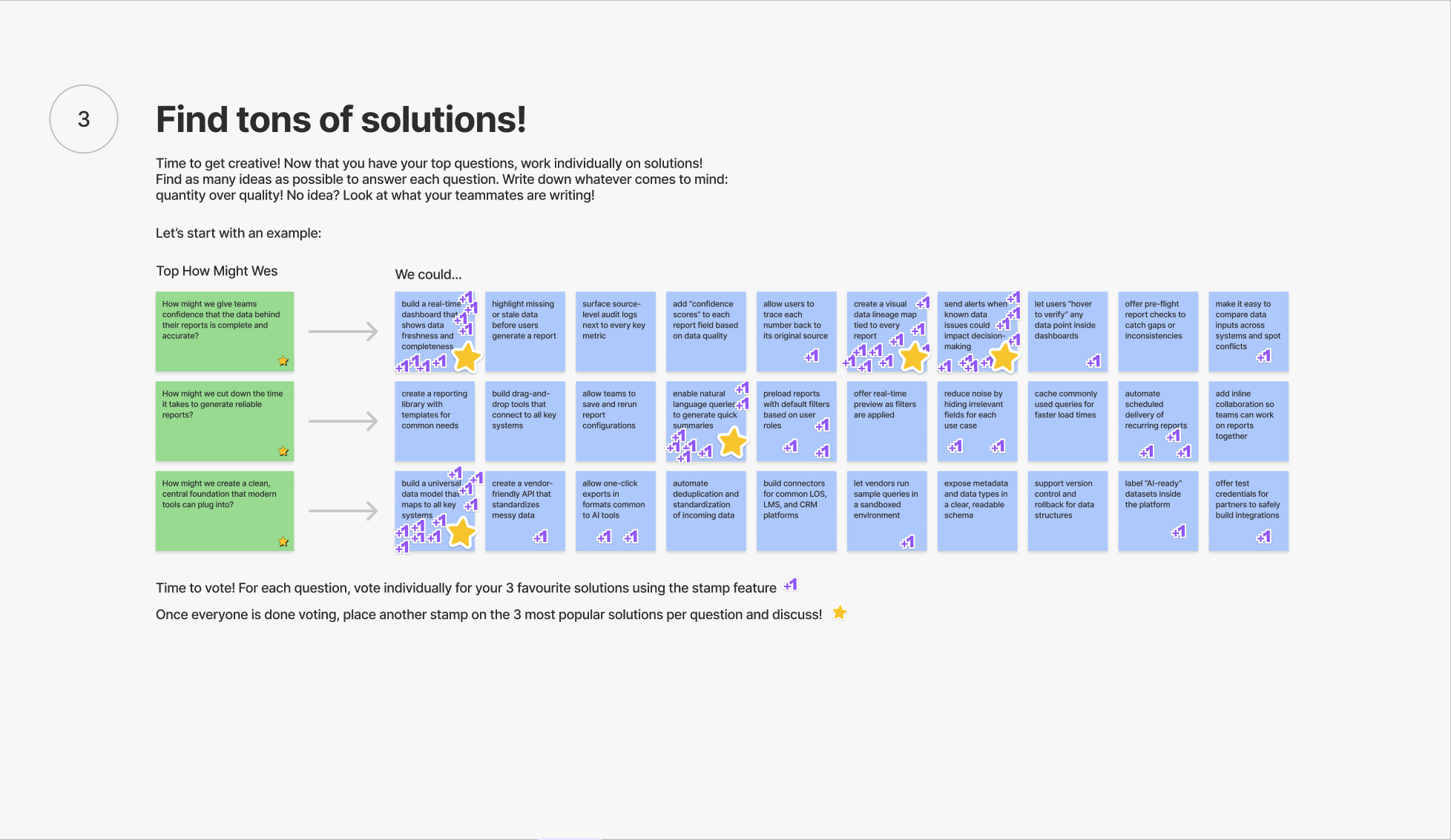
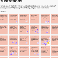
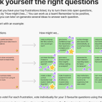
Testing wasn’t a one-size-fits-all process. We used both qualitative and quantitative data depending on what we were trying to learn. For early concept validation or workflow design, we leaned into interviews, observational testing, and follow-ups with fintech operators.. you know.. the people who lived these problems daily. For features already in use, we paired that qualitative feedback with metrics like task success, time to completion, and drop-off points in key flows. Every insight, big or small, got captured and sorted in Miro so we could spot patterns, validate decisions, and guide the next round of design.
If I had this two years ago, I would’ve avoided a full week of audit cleanup.
This solves a problem I talk about with my team every quarter. We all agree it’s a mess, but no one has the time to untangle it.
It’s like someone finally built a product that understands how these systems really work. Not how we wish they worked.
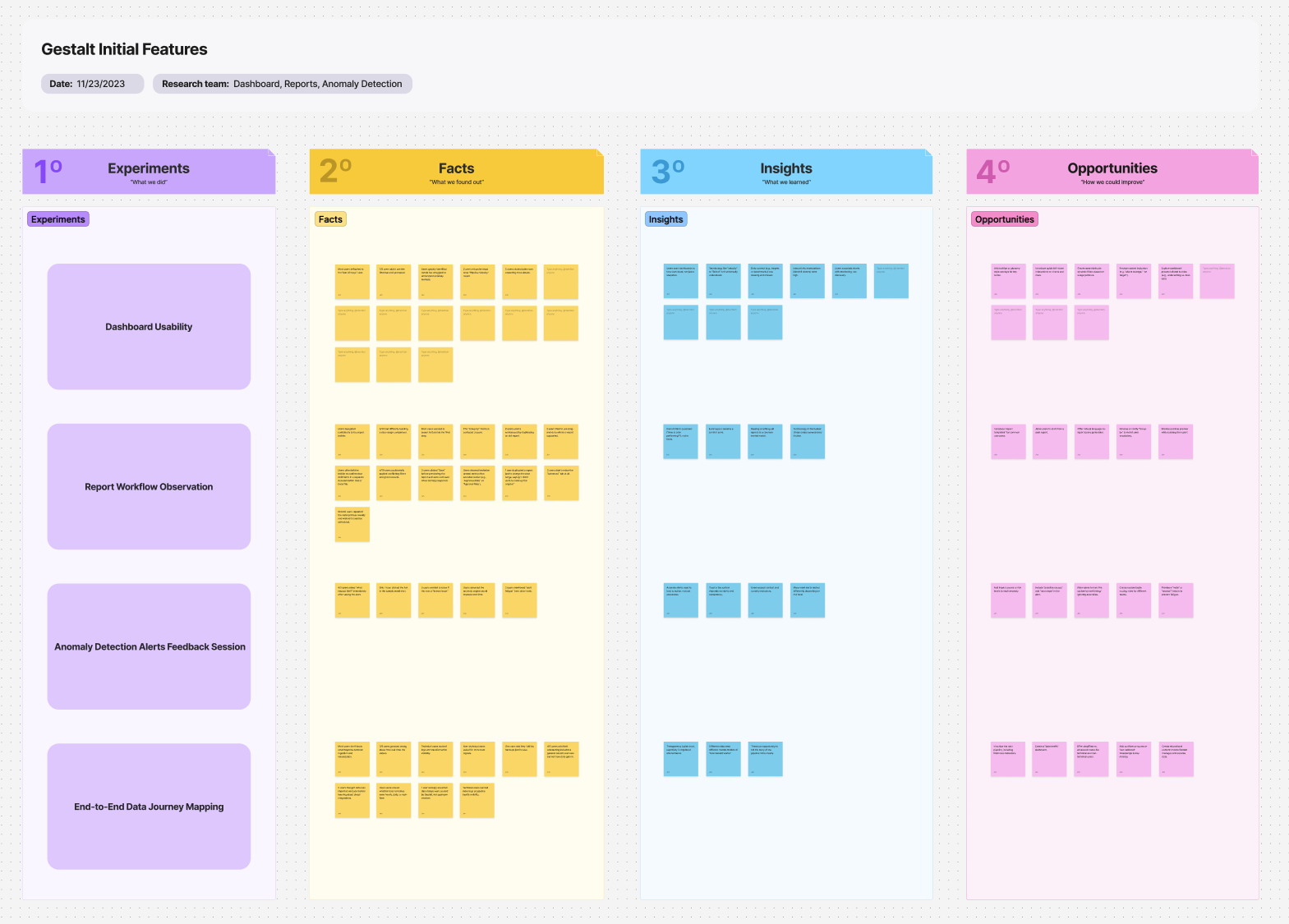
We treated testing as a loop, not a checkbox. It didn’t stop after launch. It became part of the rhythm. We checked in with early users regularly and tested new ideas directly with current or potential customers, either in person or remotely. Having a coded prototype helped a ton. It gave participants something real to interact with and made their feedback more specific. Whether they were spotting friction or suggesting improvements, the goal was always the same: get closer to what actually works for the people using it.
Want more details on how we tackled our research? Give me a call and I’ll give you the scoop!
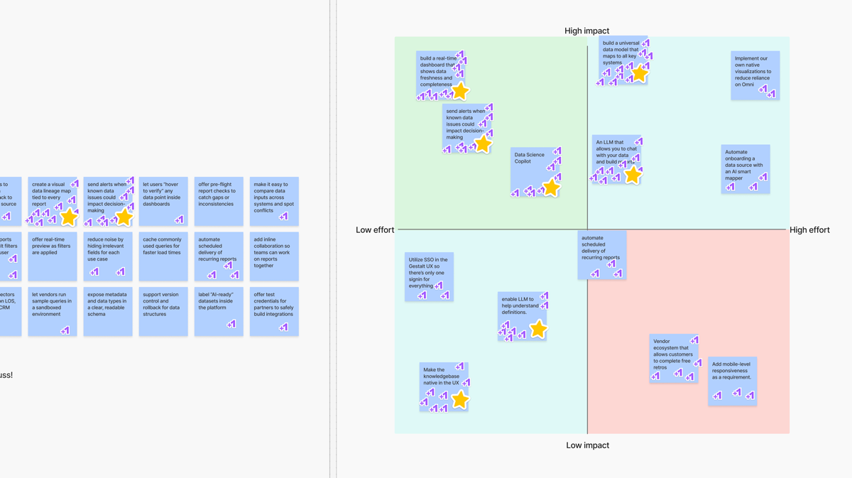
Prioritizing Features
After gathering insights from testing sessions, customer conversations, and the deep industry experience across our team, we moved into prioritization. We used the RICE scoring model to evaluate each feature based on reach, impact, confidence, and effort. It helped us stay focused on what mattered most and avoid getting pulled in by anecdotal requests or internal assumptions.
Once we had a ranked list, we didn’t stop there. We shared our thinking with the board and a few trusted experts in the lending space to pressure-test our priorities. Their feedback helped confirm we were not only solving real problems, but sequencing them in a way that aligned with how this industry adopts change.
Overheard during our prioritization process:
This should be a day-one feature. Everyone I know would expect this out of the box.
If you build this, I can stop exporting CSVs and reconciling things by hand. That alone is a win.
Honestly, even if the rest of it didn’t exist yet, I’d use it just for this feature..
Designing to Build & to Sell
A big part of leading design at an early-stage company is knowing when to optimize for shipping and when to optimize for storytelling. In this project, I had to do both, often in parallel. Some prototypes were built to convince a customer in a live demo. Others were designed to guide engineers through implementation. The key was knowing the difference and delivering accordingly.
When I was designing to build, I focused on scalability, logic, and structure. I thought about how each component would flex with real data, how the system would support new features down the road, and how to set up engineering for smooth handoff. This meant documenting flows clearly, aligning on shared patterns, and keeping close feedback loops with our dev team.
When I was designing to sell, the priorities shifted. It was about showing the vision, not the backend. The prototypes needed to feel polished, fast, and expressive, something a potential customer could interact with and immediately get it. Even if the data wasn’t live yet, the value needed to be.
Balancing both tracks took intention. But it also made the product better. In many cases one helped the other. For instance, when mocking up the authentication flow I intentially added a bit too much (?) motion between states. I did this originally to make the process feel smooth (and lets be honest, provide eye-candy). However, once we got to the build stage we found that we could use those animations to hide our security-intense loading states instead of just using a basic spinner! The fast feedback from prototypes helped inform what we built, and the engineering perspective kept our vision grounded. The best part? I didn’t have to choose one path or the other. I built both into the process.
2+ Years later
Two years in, the prototypes became product, the product became platform, and the platform became something teams now rely on every day. What started as a sprint to bring a vision to life has turned into a system that scales, flexes, and delivers real value to real users.
Along the way, I’ve shipped features, built design systems, iterated with users, partnered closely with engineers, and helped close deals by making the product feel real before it technically was. Every sprint, every test, every commit tells the story of design not just keeping up with the business, but pushing it forward.
Hover for fun
interactions!
Primary button
Date ran
January 3, 2024
Application filed
January 2, 2024
Application filed
January 2, 2024
Application filed
January 2, 2024
Text input
Label
Label
Label
Label
Inline error message
Marketing the Product
Overview
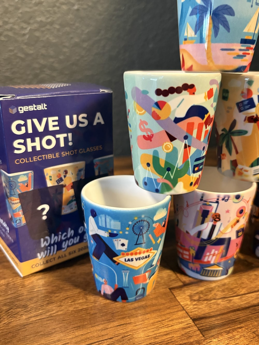
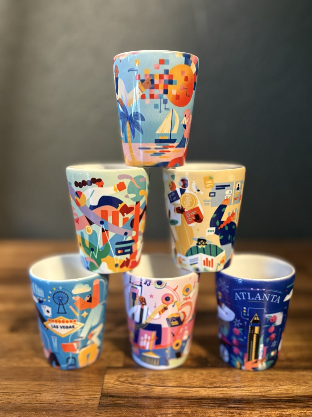
Since this is a startup, I wore a lot of hats.. even the ones that made me a bit uncomfortable. So I dusted off my graphic design and marketing skills, rolled up my sleeves, and filled the gap until we hire a proper marketing director. It’s been one big learning curve. I realized quickly that what works in DTC or tech Twitter doesn’t always land in the world of credit unions. This space runs on relationships, reputation, and showing up in person. So we leaned into that. From revamping our decks and presentations to brainstorming interactive conference experiences and giving out collectible shot glasses (with actual shots), we did what it took to stand out in a sea of sameness. And it worked.
Best idea ever. Incredible. Like ever. This is awesome. (attendees regarding our collectible shot glasses)
When people stop by and chat at an event, they already know about Gestalt. That didn’t happen a year ago.
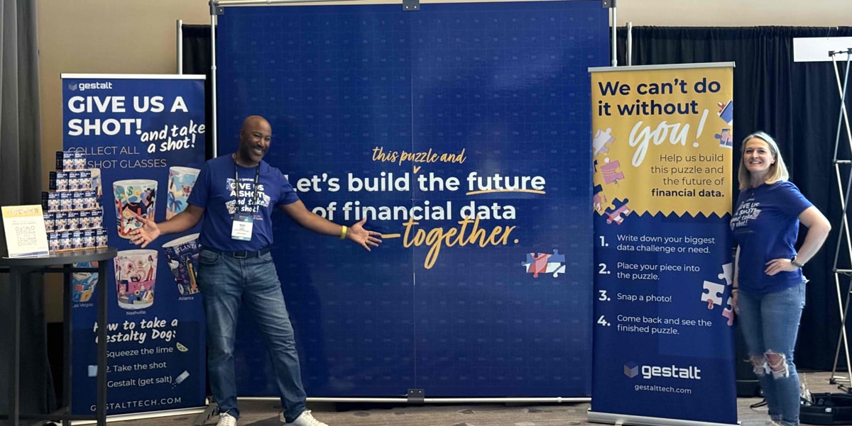
Gestalt is the best act in the 'show' (regarding our interactive puzzle at a conference).
Marketing Website
Just a quick note on our primary website gestalttech.com. This website was designed before I took over marketing design for Gestalt. Though redesigning the website with better positioning and brand is top of mind for me.. we've been unable to prioritize it because other areas are more important to our business goals right now. I suspect we will re-prioritize it soon though! :D
In the meantime we did build a video platform tailored to our investors, partners, and prospects though. We call it The Grid, read more about it below in the "Partnerships" section.
Tone
I had worked with the founders before, so I already had a feel for their tone, style, and general vibe. Stephanie, our CEO, brings this sharp, playful energy that cuts through the noise, and we wanted the brand to do the same. In the financial space, especially with credit unions, most companies end up sounding identical. Safe. Stuffy. Forgettable. We wanted to stand out. So we gave the brand a voice that’s fun, a little snarky, and unmistakably human. It’s not just marketing. It’s a reflection of the people behind the product, which fits perfectly since we’re often the ones in front of the booth.
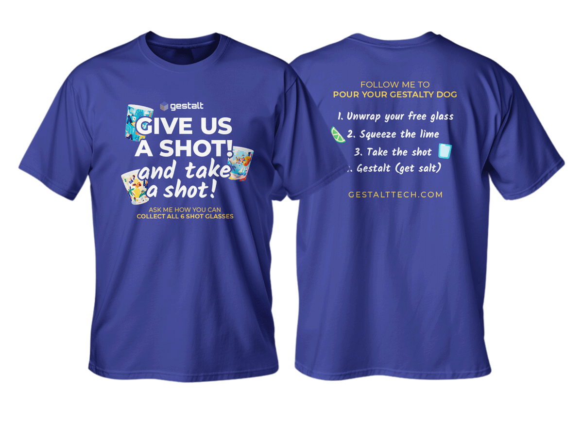
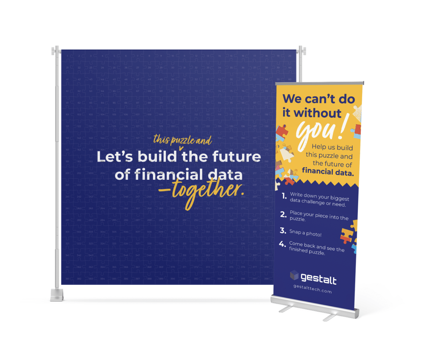
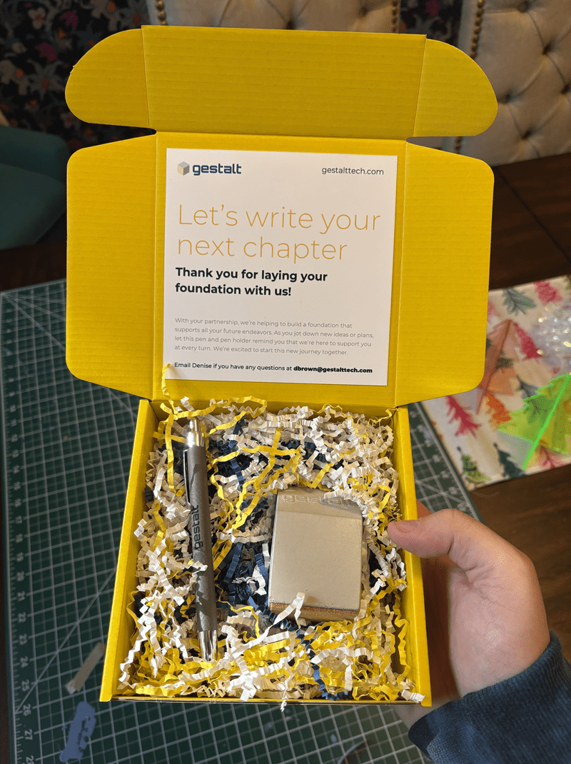
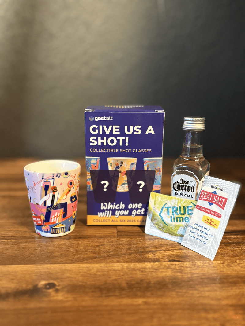
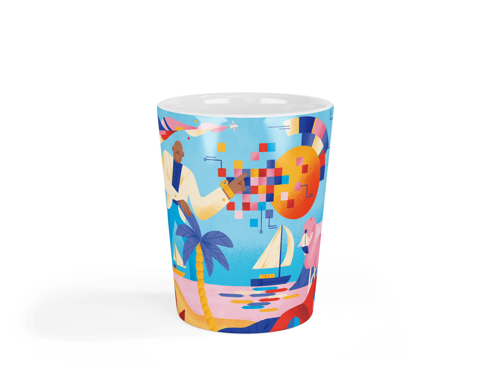
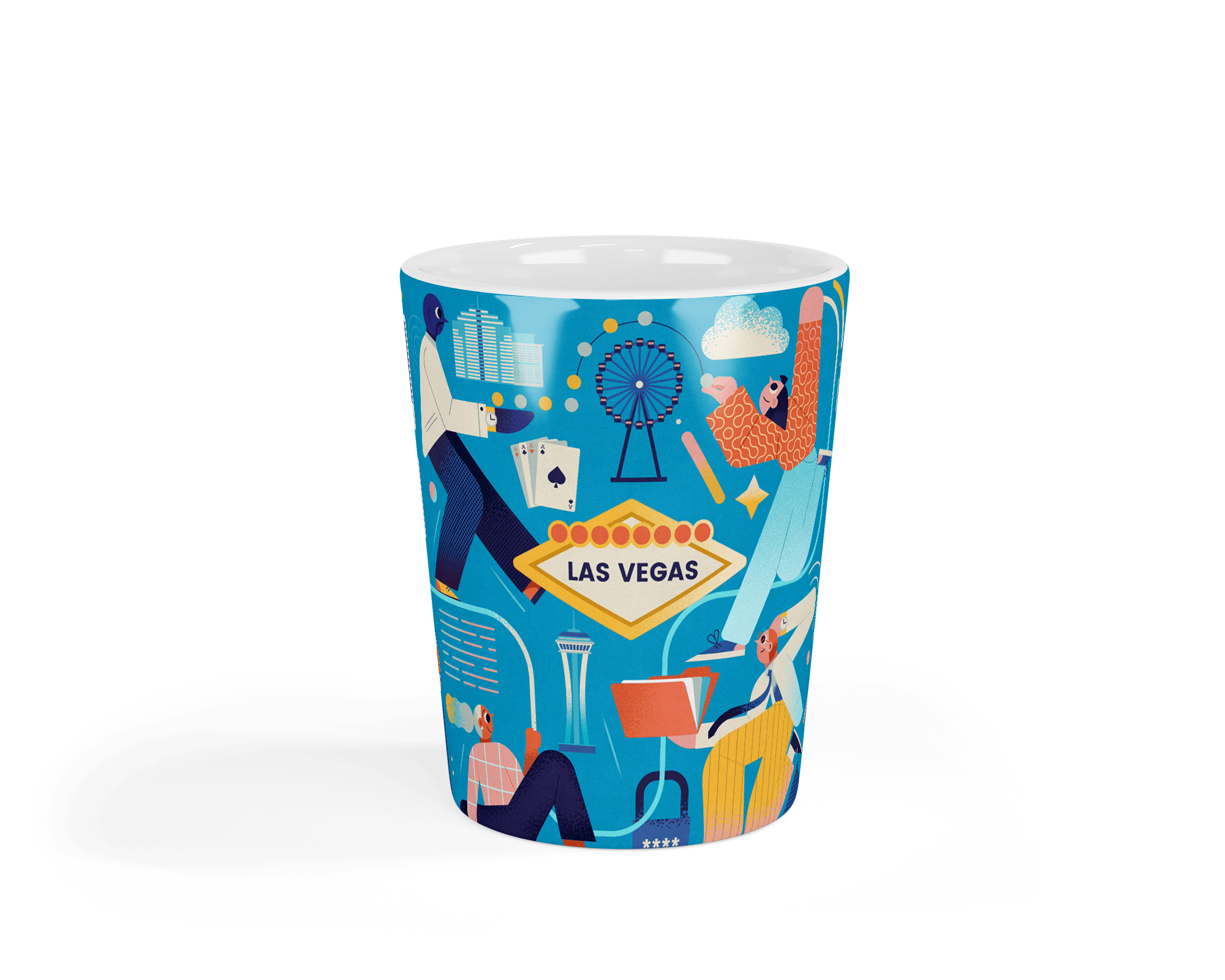
Illustration Language
I wanted our visuals to stand out in a space full of gray, gridlocked, overly enterprise-y brands. At first I used what made sense in the product: simple, clean, minimal. But as marketing picked up, it was clear we needed more energy. Brighter colors. Looser edges. Something with a little personality. I also kept things lightweight so we could move fast and not get bogged down by complex illustration systems.
The style has evolved alongside the company, and that evolution is part of the strategy. Our visuals aren’t locked into a single look. They’re built to shift, stretch, and grow. It’s a living system, and it should stay flexible enough to support whatever wild idea comes next.
The first illustrations were really just an evolution of the product UX icons.
The second evolution went isometric. This opened the door to be more artistic and less rigid.
The third evolution pushed the abstract further, adopting a trendier "bentro grid" styled language.

While I understand building a brand takes consistency, I plan to ever evolving the illustration language to meet the needs of the brand.
Decks & Presentations
Startups go through a lot of decks. Demo decks. Webinar decks. Investor updates. Board updates. Kickoffs, retros, partner trainings, use-case overviews, you name it. Each one has a slightly different audience and purpose, but they all need to feel like they came from the same company. I worked on tightening up the visual language, built flexible templates, and made sure we had a solid foundation that could scale without getting stale. The goal was to make it easier for the team to move fast while still looking sharp.
Conferences
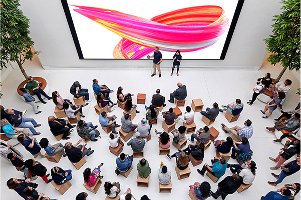
In this industry, conferences are everything. Deals start at the booth, relationships grow over dinner, and showing up well can make or break your pipeline. So we got creative. We leaned into interactive experiences, built real-world moments around our brand, and made sure people didn’t just walk by, they walked over.
To boost engagement, we created limited-run collectibles like custom shot glasses (and yes, we poured actual shots). The goal wasn’t just swag, it was to create FOMO. It worked. Our booth went from quiet to buzzing, with attendees bringing others back just to show them where they got their collectible, or what we were up to. In a space full of sameness, that little extra effort made a big difference.
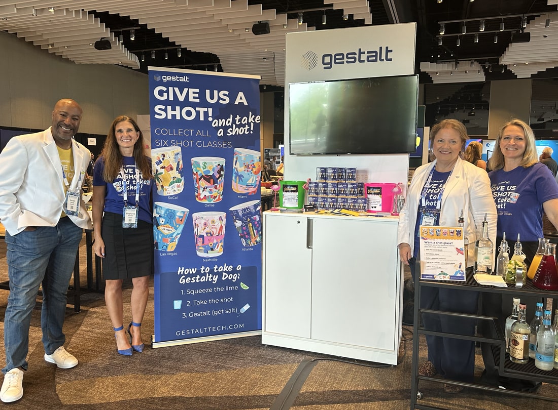
I worked with 6 different artists and illustrators to create our city themed collectible shot glasses. They were such a big hit! Conference attendees that "didn't like swag" would still stop by our booth because they said our collectibles were "works of art" and they wanted to collect them all.


Partnerships & The Grid
In this space, relationships are everything. Credit unions tend to trust familiar names, so getting in the door with a new product like Gestalt is tough. That’s why partnerships became a core strategy. Partnerships gave us credibility, reach, and a way to scale sales without growing the team.
With just one dedicated sales lead (our CRO) and a CEO wearing multiple hats, we teamed up with complementary companies to co-sell. We trained their teams, built easy-to-share decks, and made sure Gestalt fit naturally into their demos. I also headed up cohort-based referral contests with rewards.
To strengthen those relationships and create a more dynamic touchpoint for everyone from partners to prospects, I also built The Grid—our own on-demand video platform. It’s a central hub where influencers, investors, and customers can explore Gestalt’s story, hear directly from our leadership team, and learn about the broader lending data landscape. It also gives partners a simple way to share our message and direct referrals, while offering an easy path for viewers to sign up for our twice-weekly live demos. The Grid has become both a marketing engine and an educational resource, extending the reach of every partnership we build.